Getting Started Guide for Schoology Learning Customers
- PowerSchool Community
- :
- Our Community
- :
- Welcome and Getting Started
- :
- Getting Started
- :
- Getting Started Guide for Schoology Learning Customers
Getting Started Guide for Schoology Learning Customers
- Subscribe to RSS Feed
- Bookmark
- Subscribe
- Printer Friendly Page
- Report Inappropriate Content
Welcome Schoology Learning Customers!
Locating Schoology Articles
- If you were directed to this post from an old article link, we have attached the updated links at the bottom of this post.
- Please be sure to log into Schoology first, then go to Support > Community & Support before using the new links.
Orientation Video
How to Access PowerSchool Community
- Log into Schoology Learning as you currently do. It is important to start in Schoology Learning to ensure you have the right access in our community.
- Select Support on the bottom of the page.
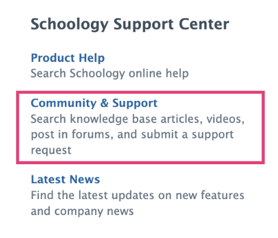
- You will see several options in the pop-up dialog box, click on Community & Support. This will give you access to PowerSchool Community and all of our Schoology Learning content.
Product Help
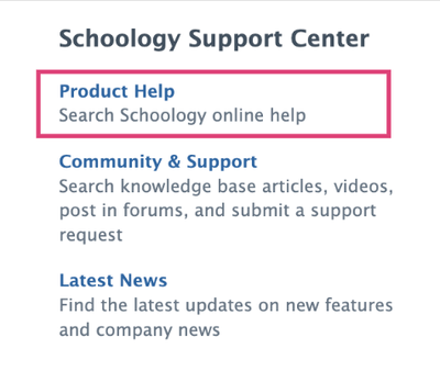
Select Product Help from the same pop-up dialog box to access product help topics and release-specific information. We have migrated content to the new Product Help space. Links from existing help center articles will redirect to the new help site.
Contacting Support
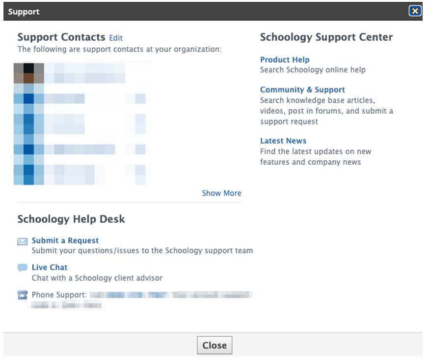
Support Contacts will have additional options under Schoology Help Desk, which will connect to PowerSchool Community to submit a request or launch a live chat.
Schoology Learning Page
Once you access PowerSchool Community through Schoology Learning, you will automatically be directed to the Schoology Learning page where you can access all of your Schoology Learning resources, including a forum, knowledge base, chat, case portal, ideas portal, and more.
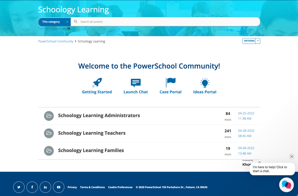
Once logged in, you explore our full community resources. You can always navigate back to the Schoology Learning page by going to Product Support > Schoology Learning in the top navigation bar.
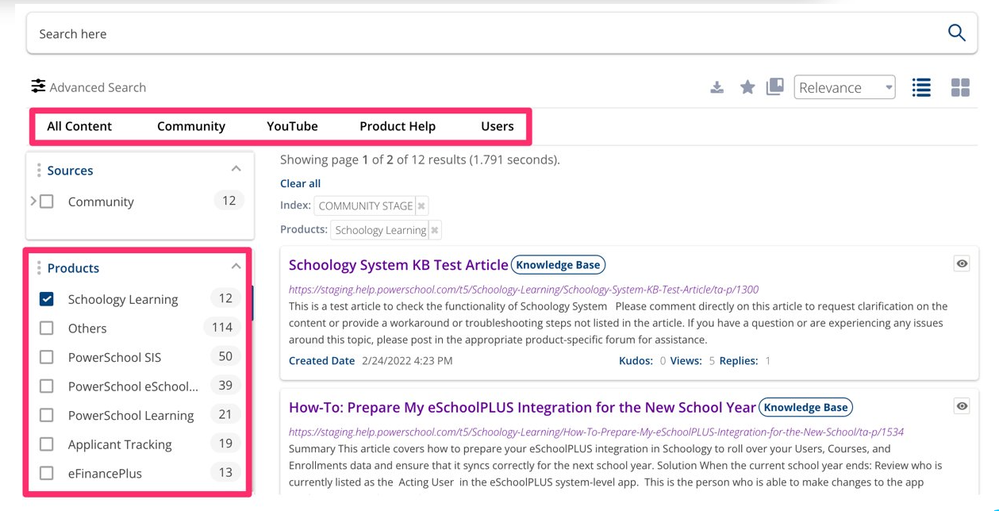
PowerSchool Community Search
- Enter key words in the search bar on top of the Schoology Learning page to suggested resources.
- Click enter from the search bar to navigate to our full Search Page.
- You'll see options to narrow down your search by product, source, content, and more.
- See our Search Tips for more information.
PowerSchool Ideas Portal
The Ideas Portal is where you can share your product enhancement requests. Easily access this page by navigating to Contact Support > PowerSchool Ideas Portal.
You can add a new idea, vote, or comment on others’ ideas. Learn more about how to submit an enhancement request through our Ideas Portal.
FAQs
Question
What if I already have a PowerSchool Community account?
Answer
If you already have a PowerSchool Community account, no need to create any additional accounts. When you click on Community & Support from Schoology Learning, we will easily log you in to PowerSchool Community.
Question
What will happen to my historical (closed) cases?
Answer
Customers will be able to see their cases (tickets) dating back to January 2020 using the case portal in PowerSchool Community.
Question
What if I have direct links to old articles saved. Will those links still work?
Answer
All resources from the Schoology Community and Help Center have been migrated to PowerSchool Community and our new Product Help site. Old links will redirect to the new ones. Note: this update is in progress and has not yet completed.
- Product Help: Anything that is migrated to product help will automatically redirect to the new article.
- Community: Anything that is migrated to Community will redirect to this Getting Started article. We have added a document with the new links at the bottom of this article. Please note: A login via Schoology Learning is needed to access these resources.
Question
How will enhancement/feature requests work moving forward?
Answer
Top requested feature ideas have been reviewed and migrated based on customer feedback to our global PowerSchool Ideas Portal. See the section above for more details on the Ideas Portal.
Question
Will the support “S” bubble in the lower-right corner of my Schoology Learning page still be accessible?
Answer
The “S” bubble has migrated to the new PowerSchool Assistant bubble in PowerSchool Community, located on the bottom of the Schoology Learning page.


